A world where being healthy
is easily accessible to everyone.
A world where being healthy
is easily accessible to everyone.
A world where being healthy
is easily accessible to everyone.
Hello Eggs, an Indian egg retailer, sources directly from farms. After years of service, they had an appetite for something new. With competition heating up and their offerings evolving, they needed a brand as fresh as their eggs.
Our challenge is to build a brand strategy and identity that conveys simplicity and wit, while demystifying critical information for customers, leaving them with clarity and smiles.
Logo
Identity
Strategy
Logo
Identity
Strategy
Logo
Identity
Strategy
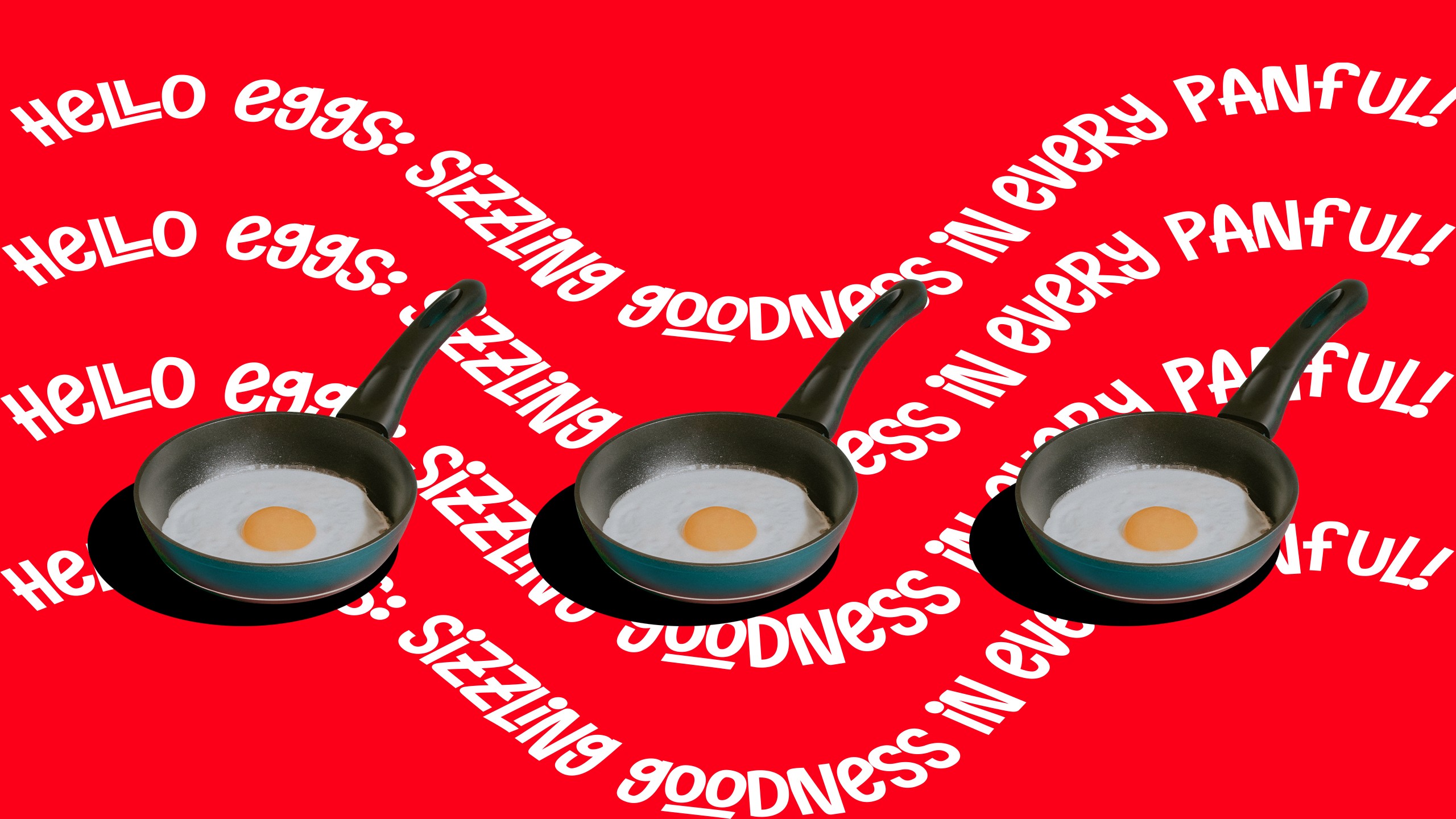
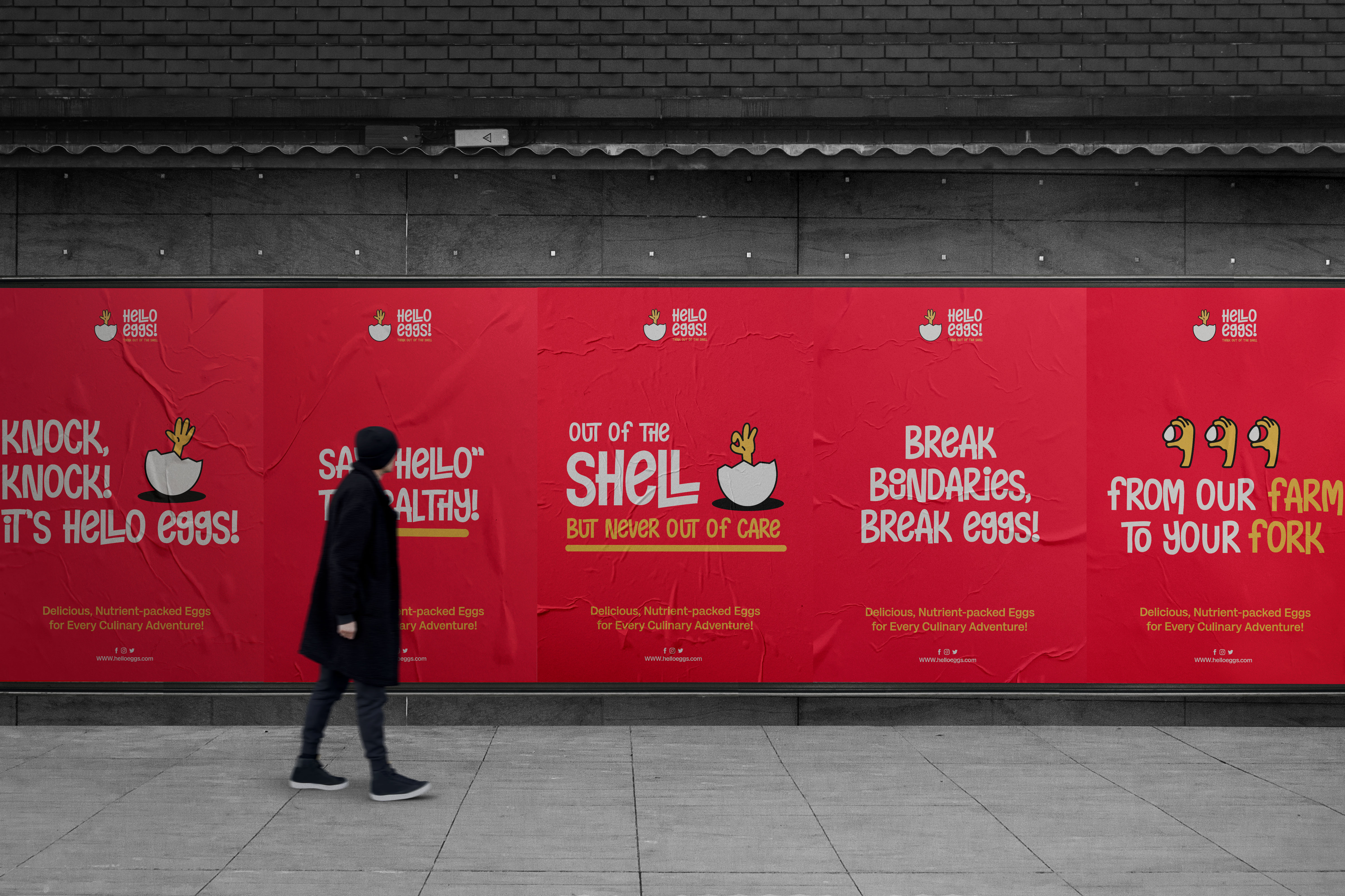
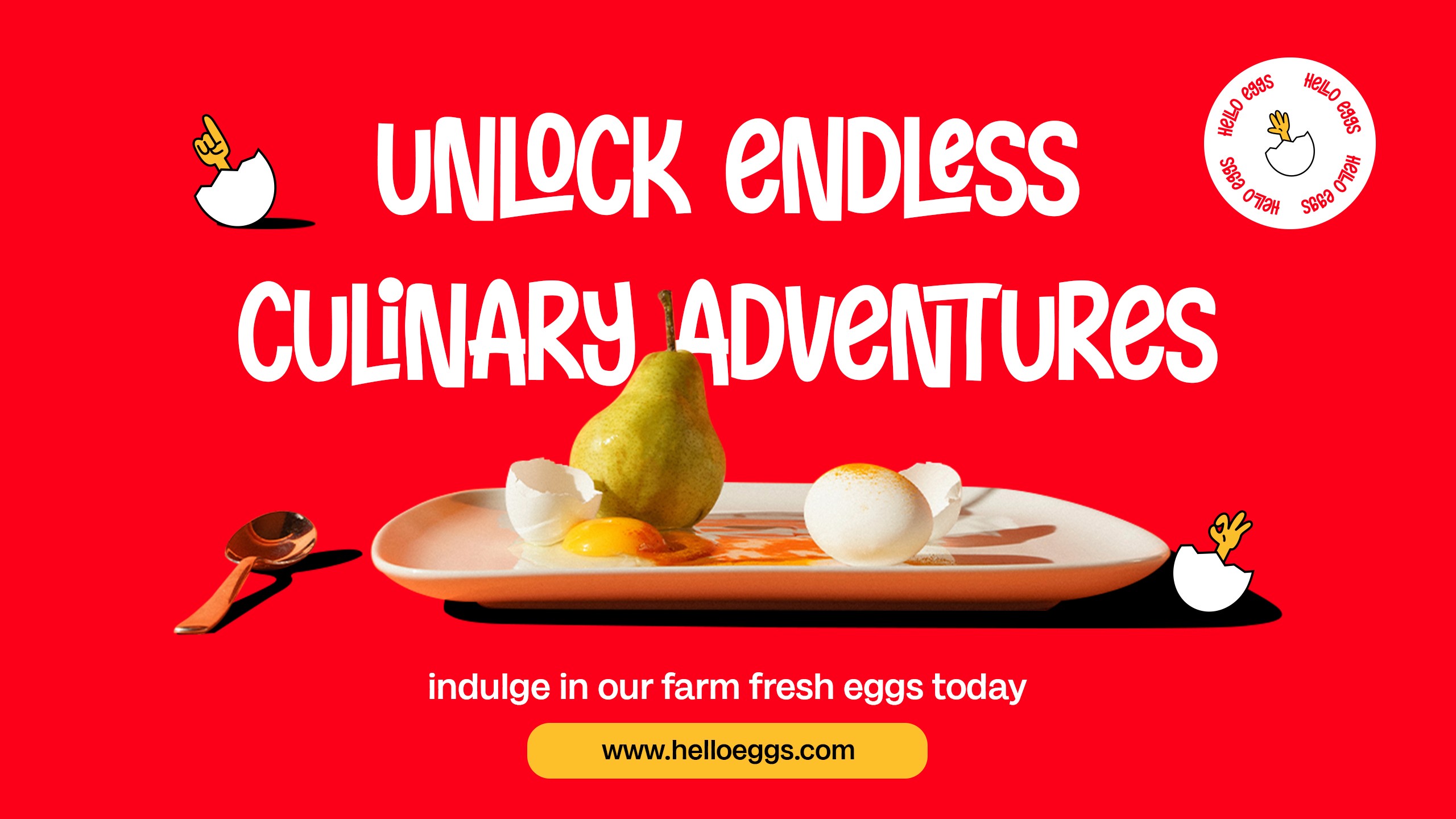
Eggsactly What You Need: Simple, Clear, and Witty
Eggsactly What You Need: Simple, Clear, and Witty
Eggsactly What You Need: Simple, Clear, and Witty
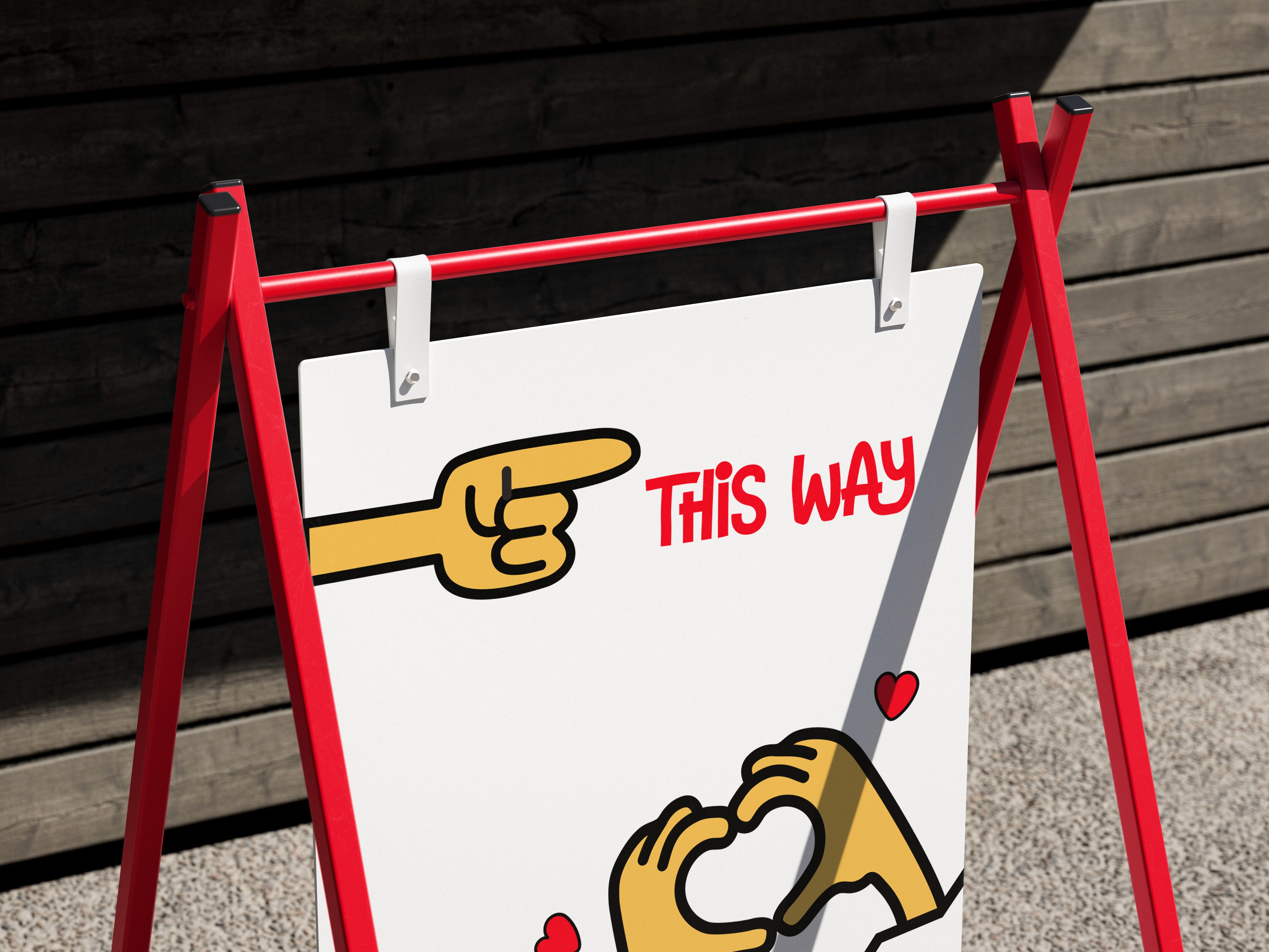
We aim to avoid jargon, making information easy for customers to understand. Our communication should be fun yet tasteful, balancing wit
with respect.
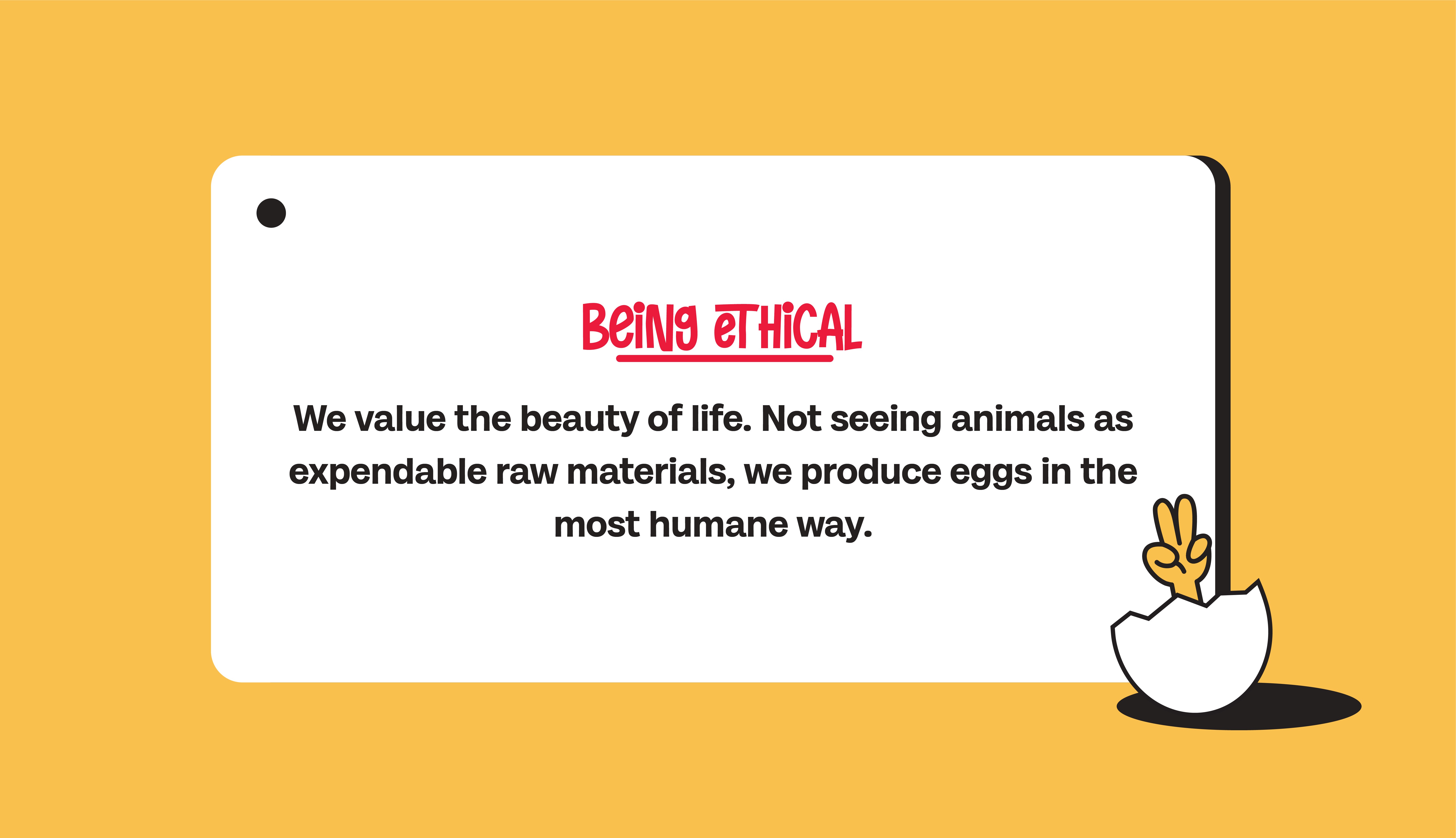
Managing customer emotions with a mix of sense, sensibility, and light-heartedness is essential.
We aim to avoid jargon, making information easy for customers to understand. Our communication should be fun yet tasteful, balancing wit
with respect.
Managing customer emotions with a mix of sense, sensibility, and light-heartedness is essential.
We aim to avoid jargon, making information easy for customers to understand. Our communication should be fun yet tasteful, balancing wit
with respect.
Managing customer emotions with a mix of sense, sensibility, and light-heartedness is essential.
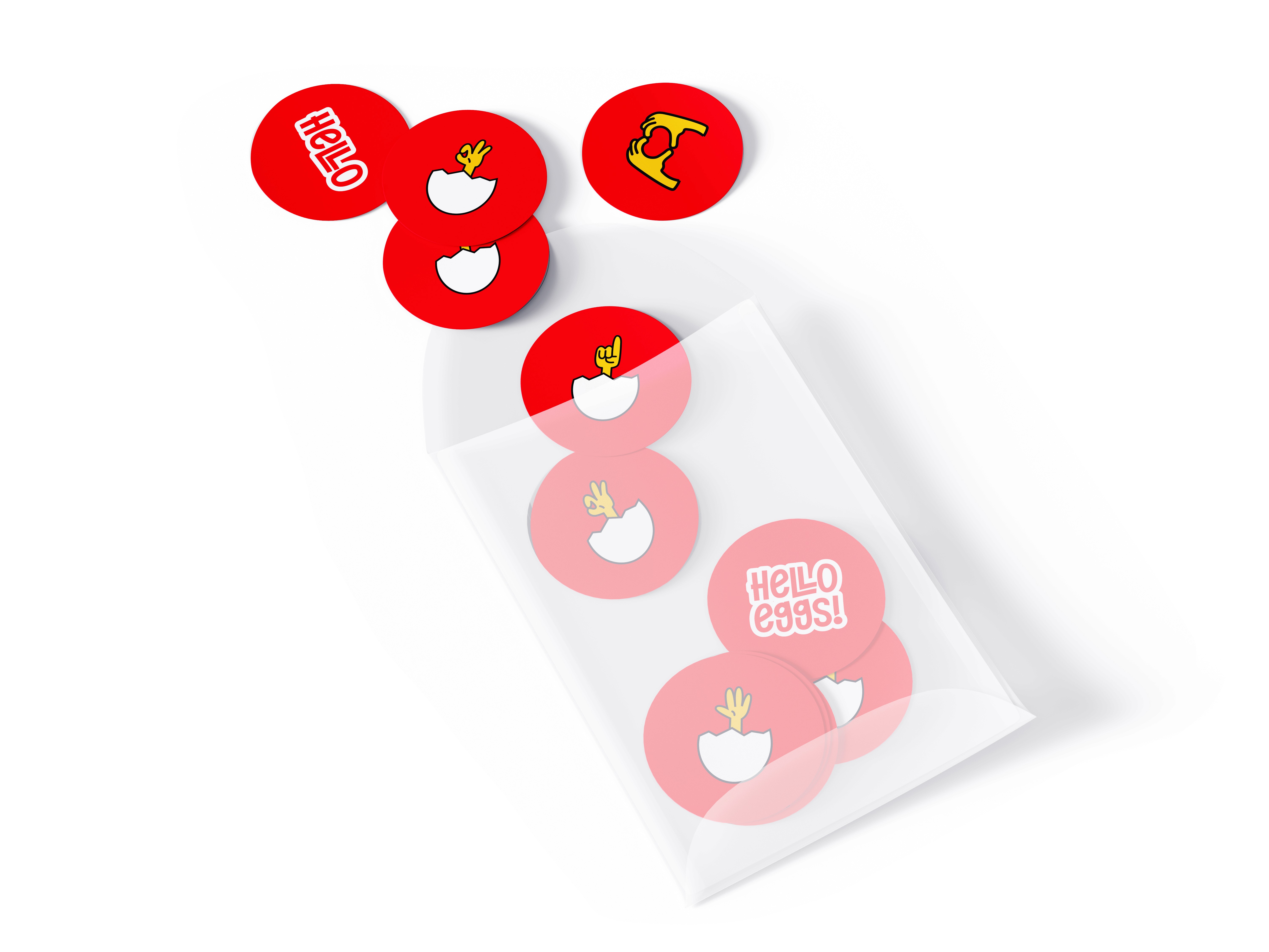
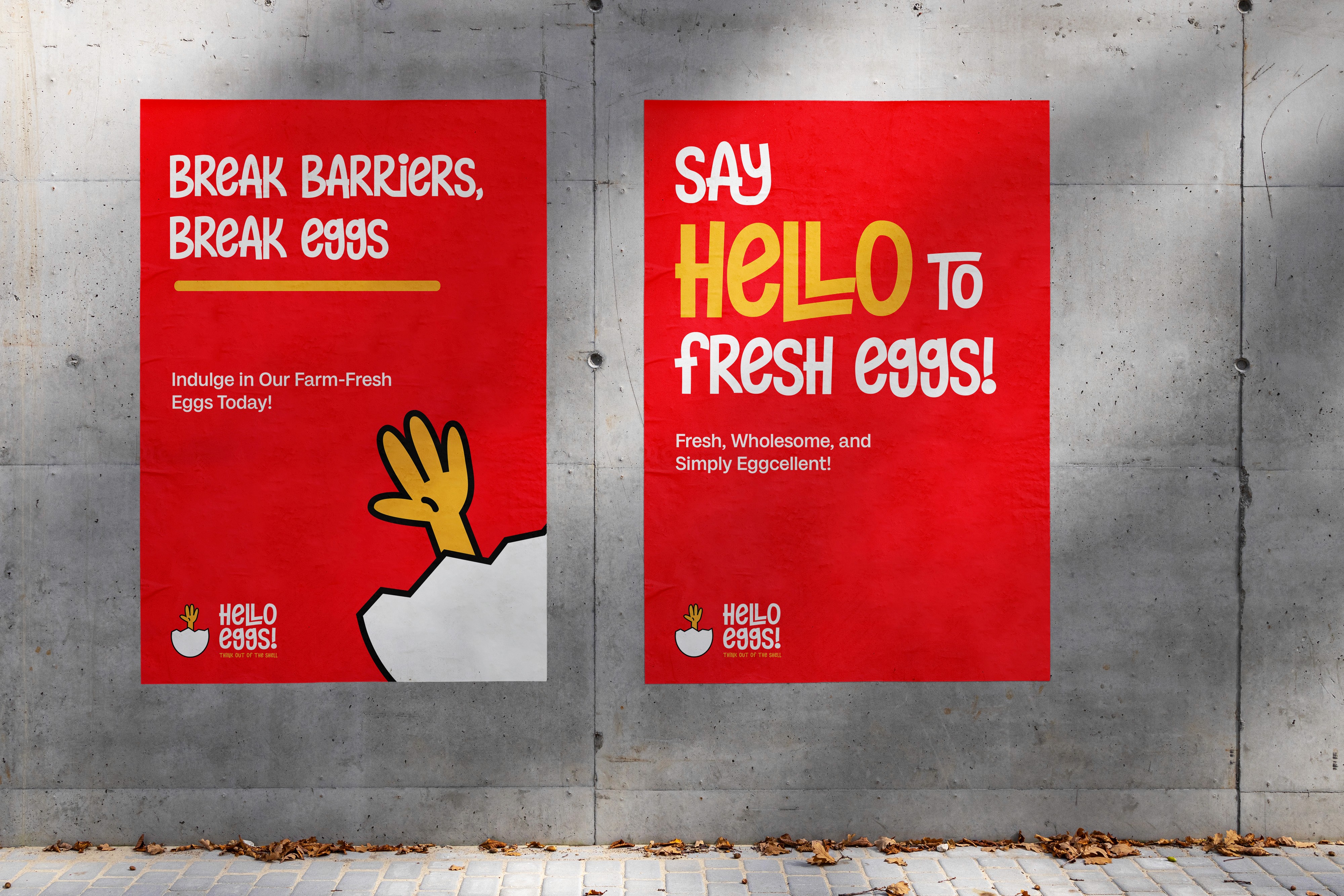
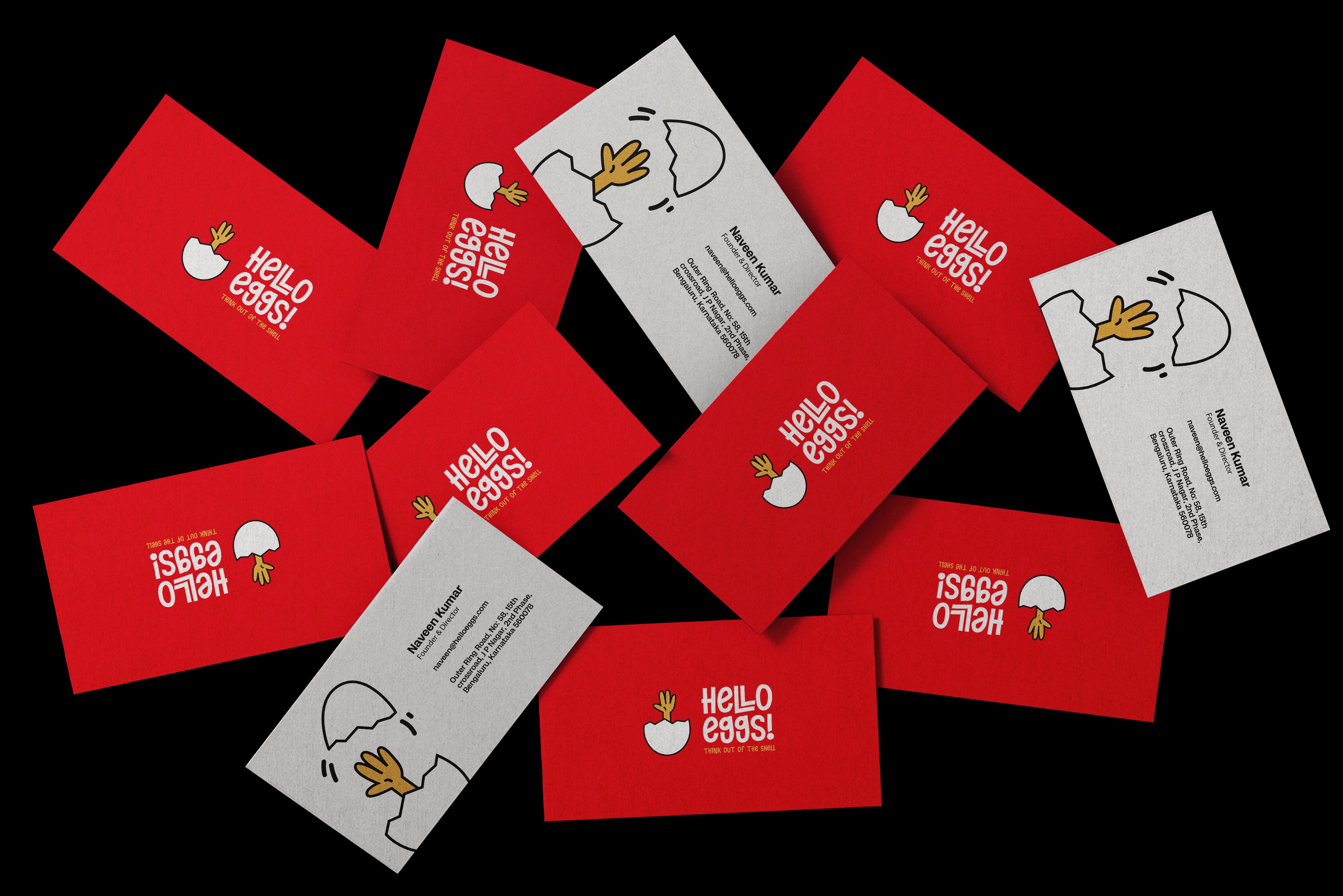
Hello the logo…
Hello the logo…
Hello the logo…
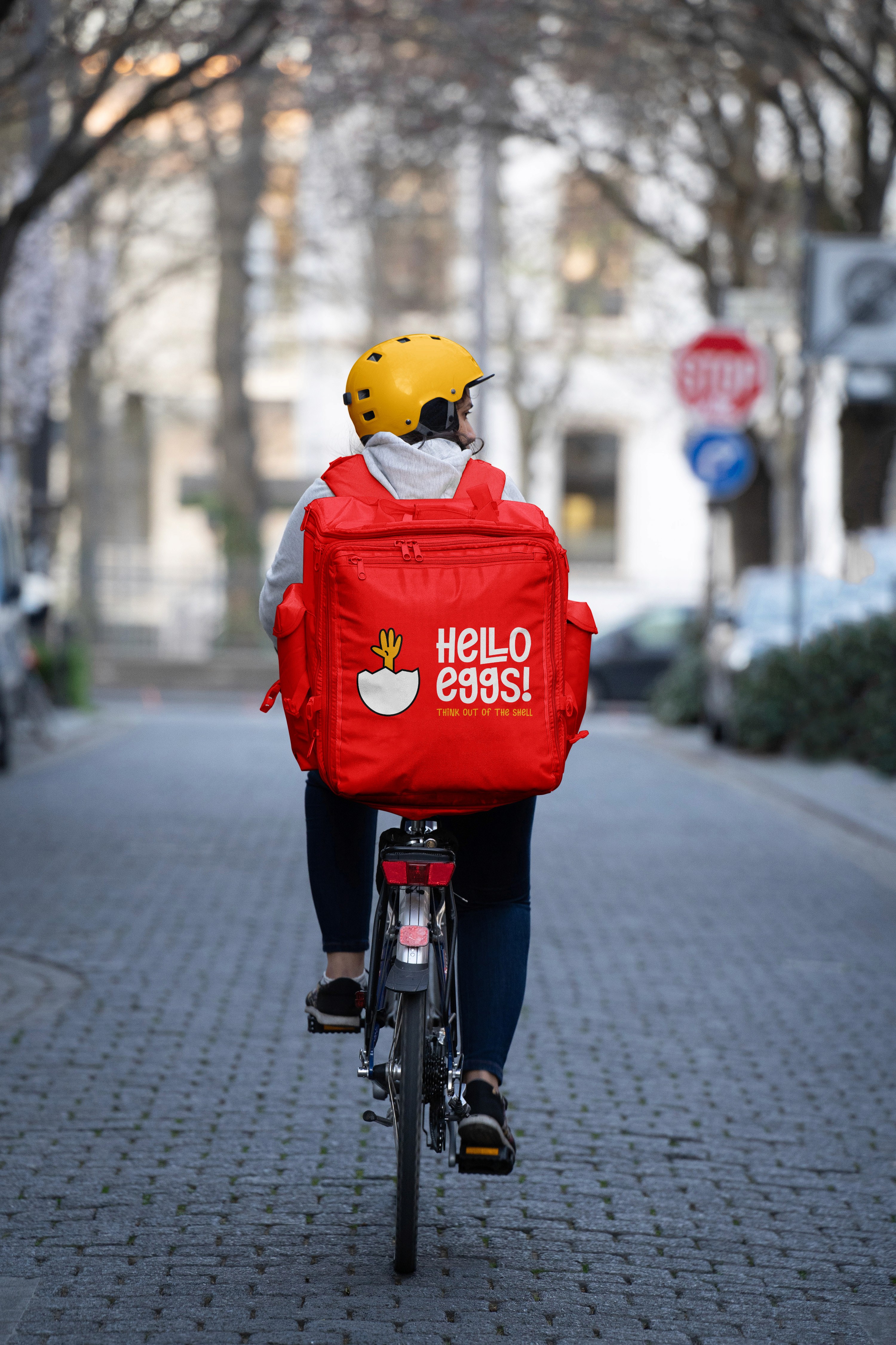
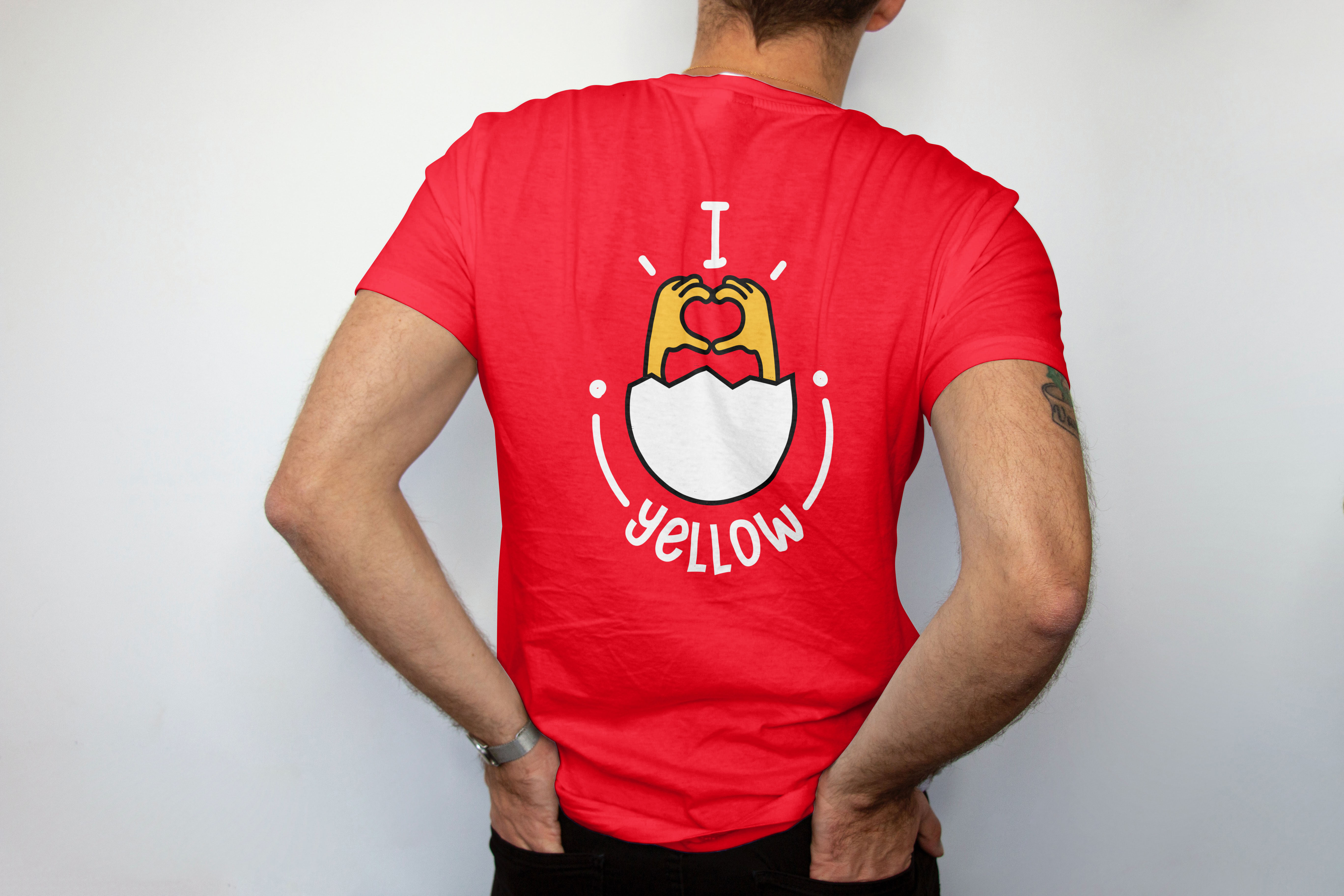
The new logo embraces a playful and cheerful design, featuring a rising hand to mimic Hello Eggs' positioning statement 'Thinking out of the shell' and incorporating the 'hello' word
in the name.
The new logo embraces a playful and cheerful design, featuring a rising hand to mimic Hello Eggs' positioning statement 'Thinking out of the shell' and incorporating the 'hello' word
in the name.
The new logo embraces a playful and cheerful design, featuring a rising hand to mimic Hello Eggs' positioning statement 'Thinking out of the shell' and incorporating the 'hello' word
in the name.
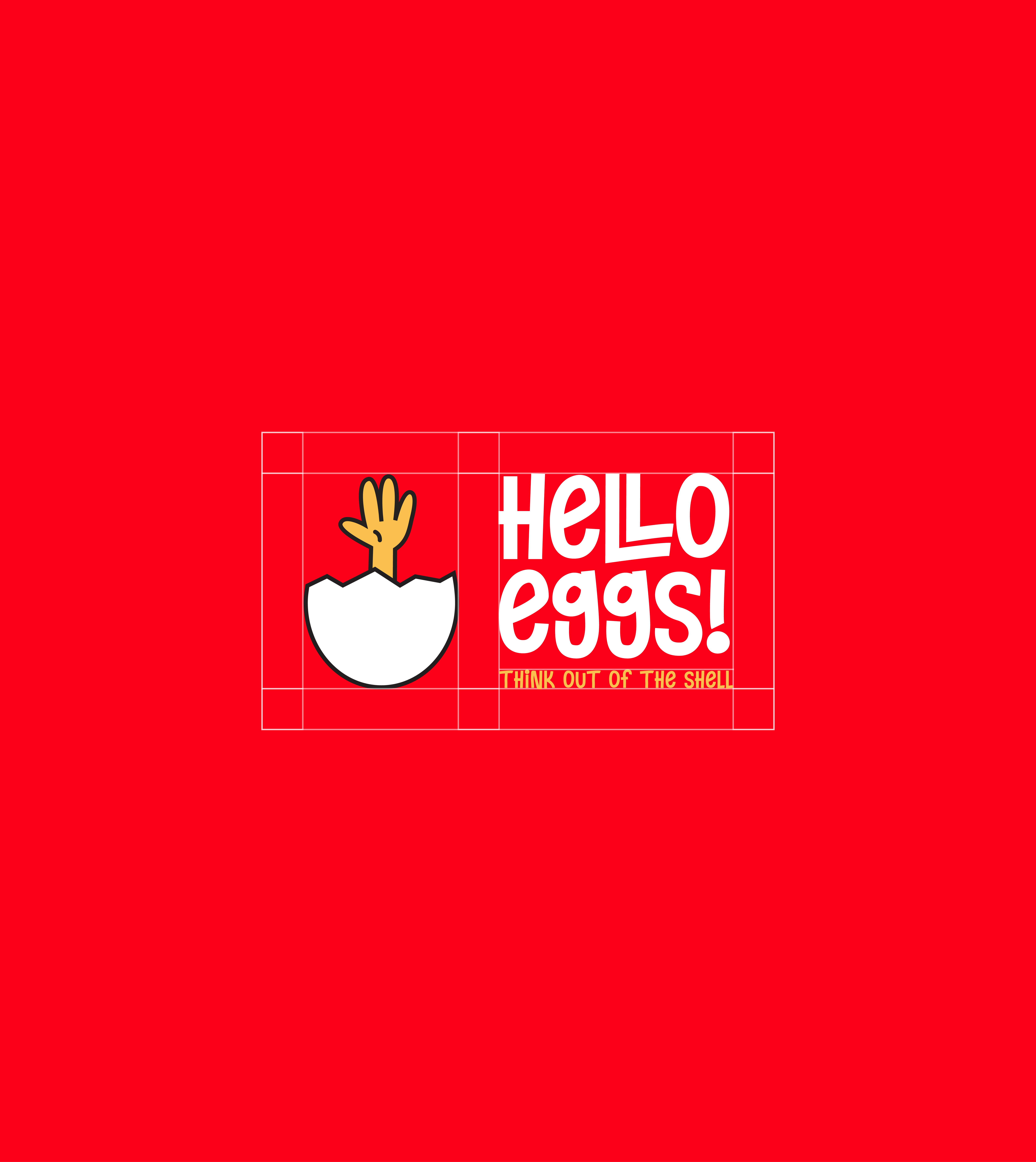
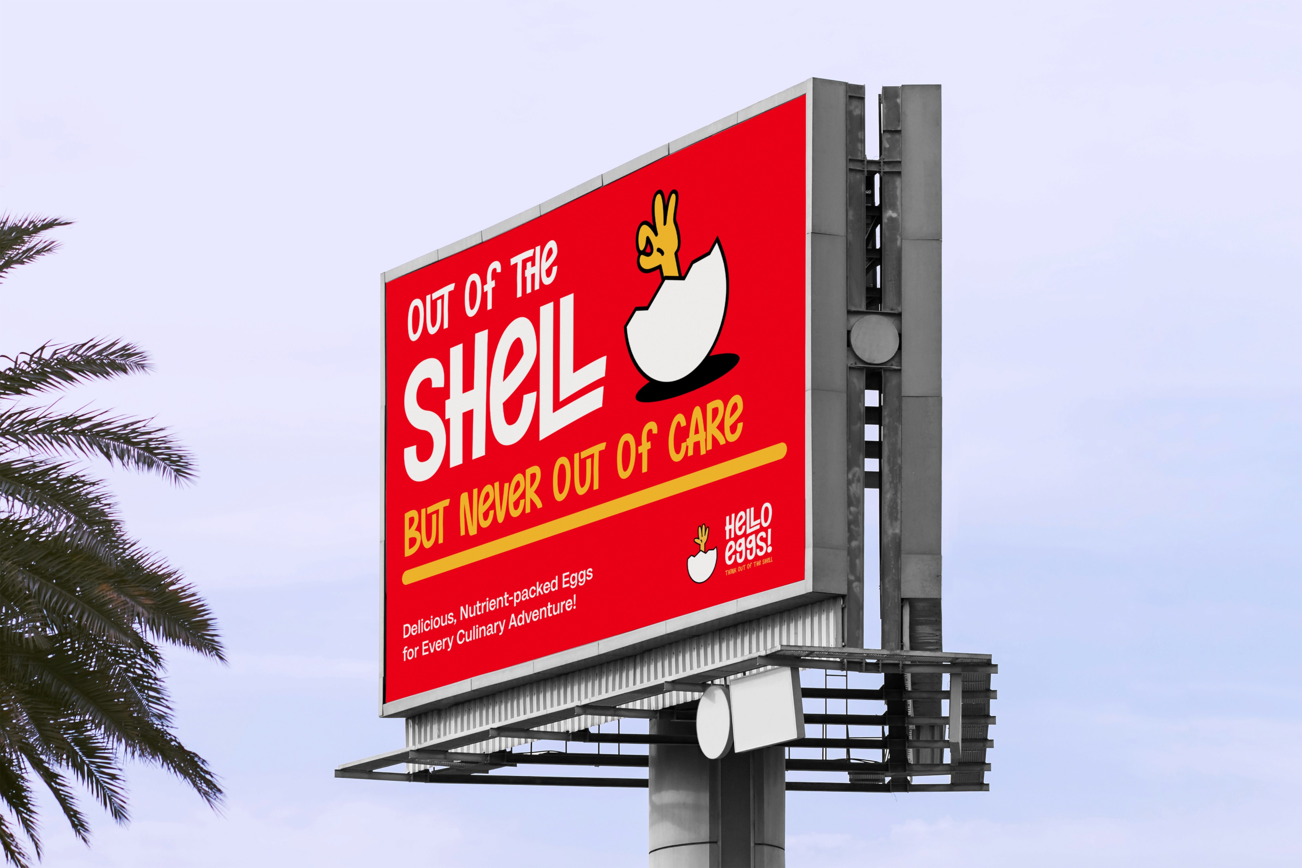
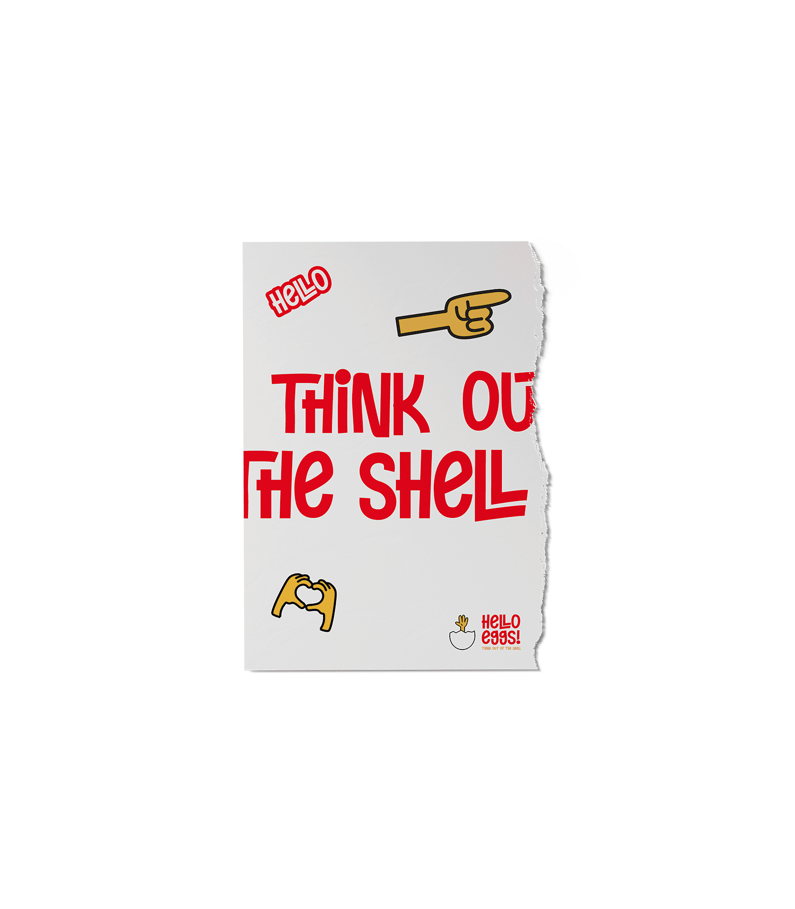
Think out of the shell
Think out of the shell
Think out of the shell
The brand idea, 'Think Out of the Shell,' is a crisp and intelligent expression driven by the innovative spirit that the brand brings to business and the experiential value it seeks to provide
to consumers.
The brand idea, 'Think Out of the Shell,' is a crisp and intelligent expression driven by the innovative spirit that the brand brings to business and the experiential value it seeks to provide
to consumers.
The brand idea, 'Think Out of the Shell,' is a crisp and intelligent expression driven by the innovative spirit that the brand brings to business and the experiential value it seeks to provide
to consumers.

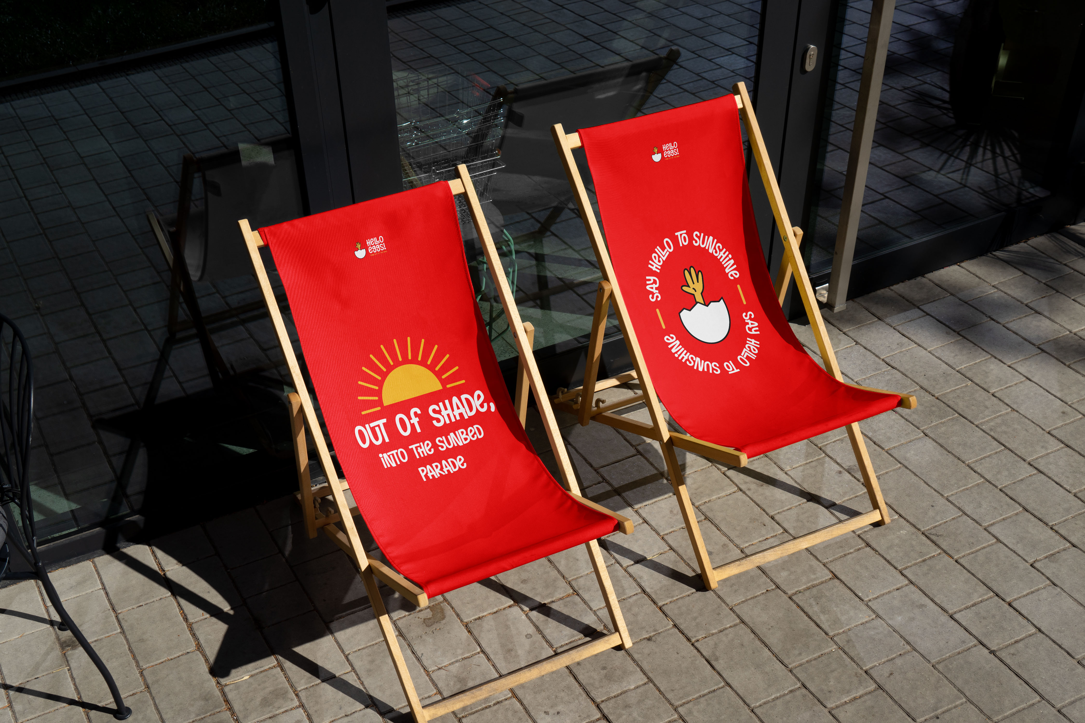
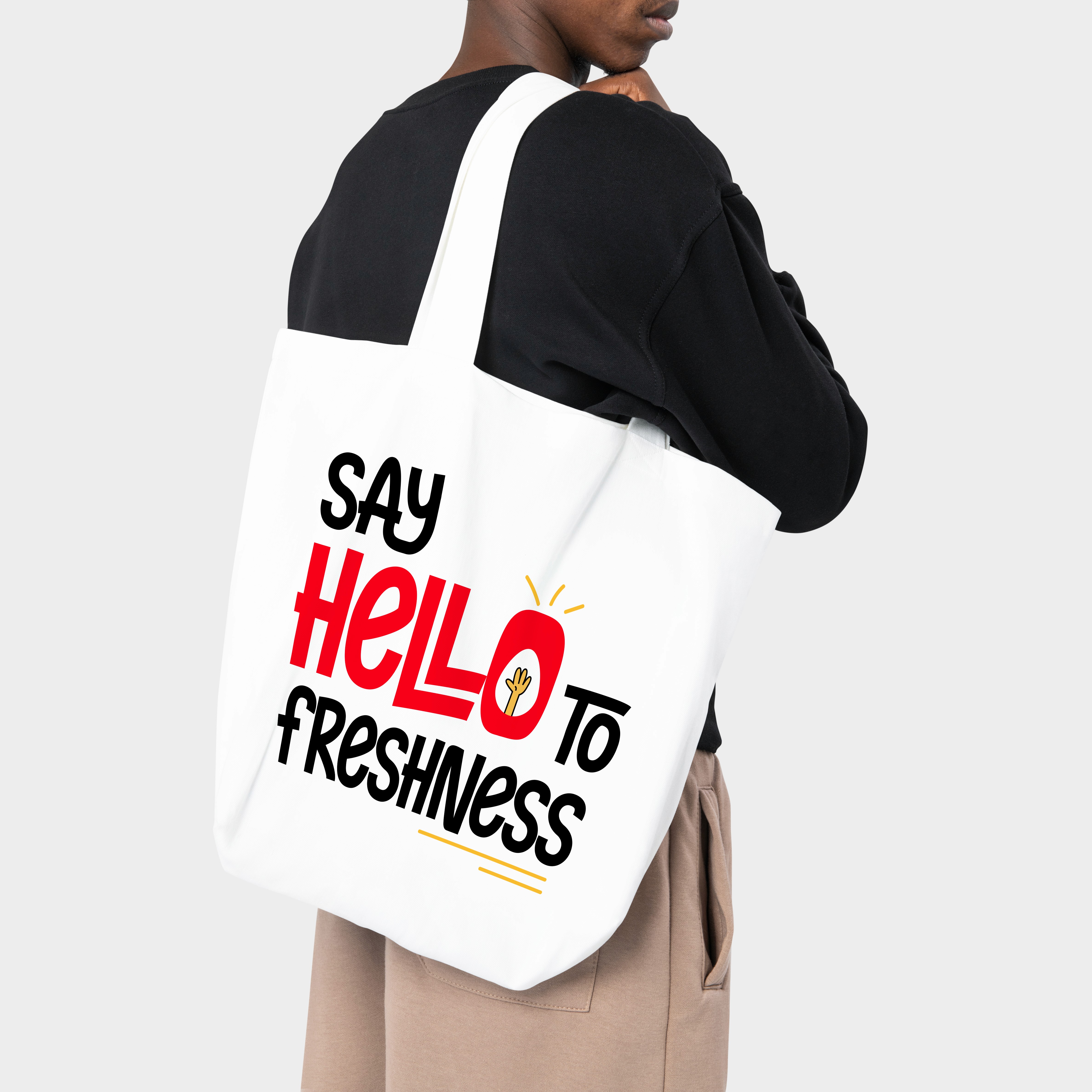
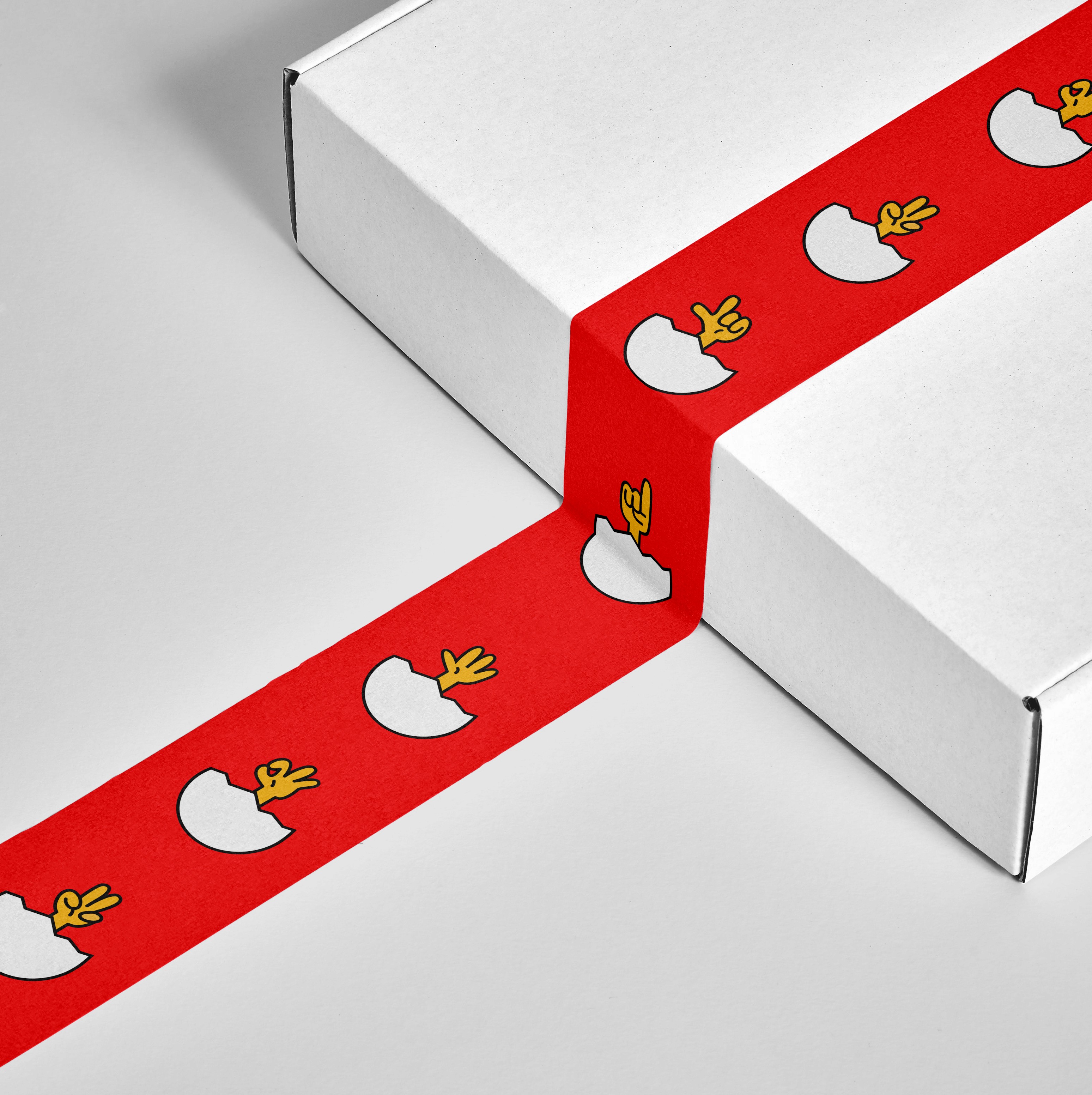
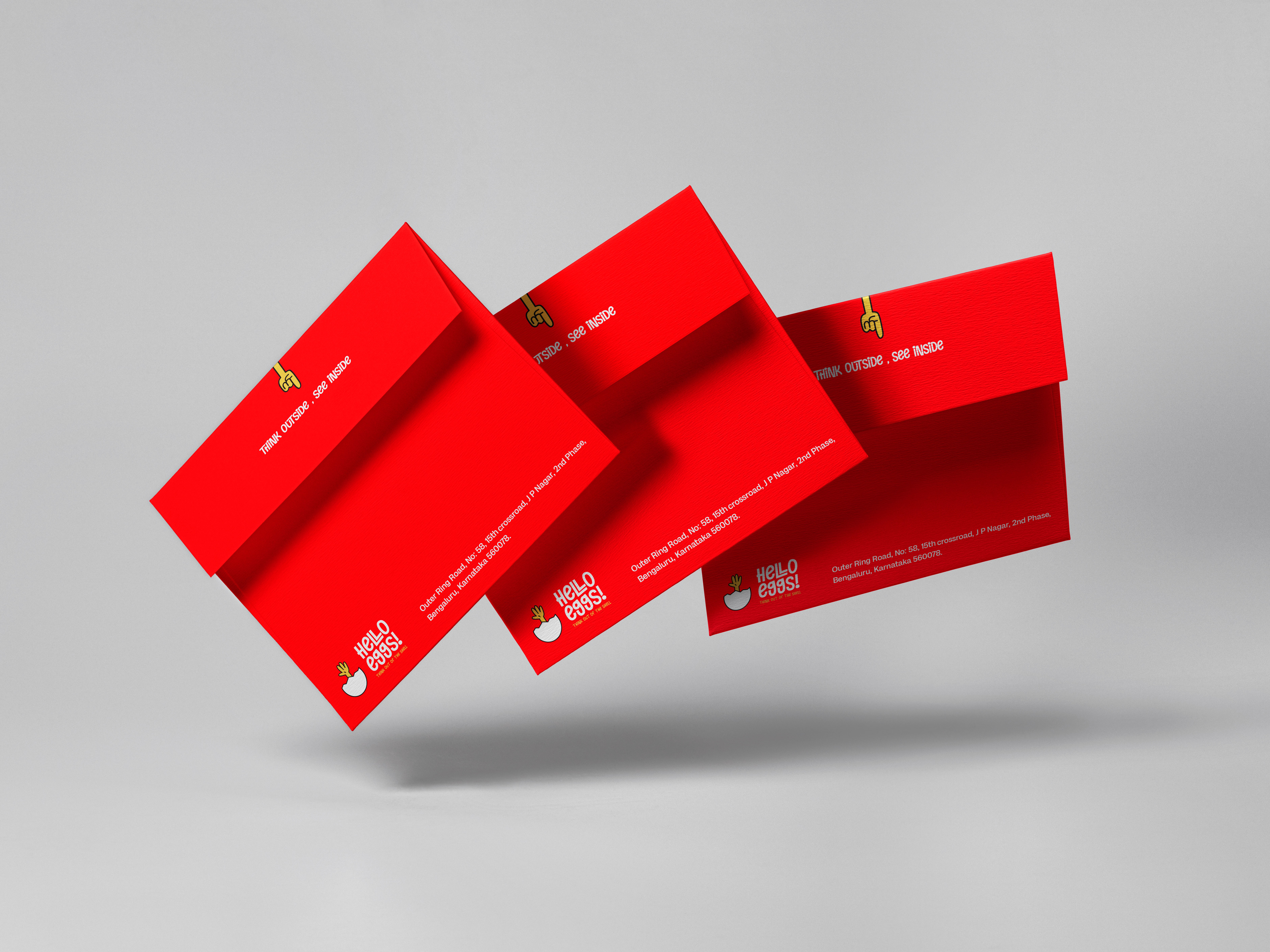
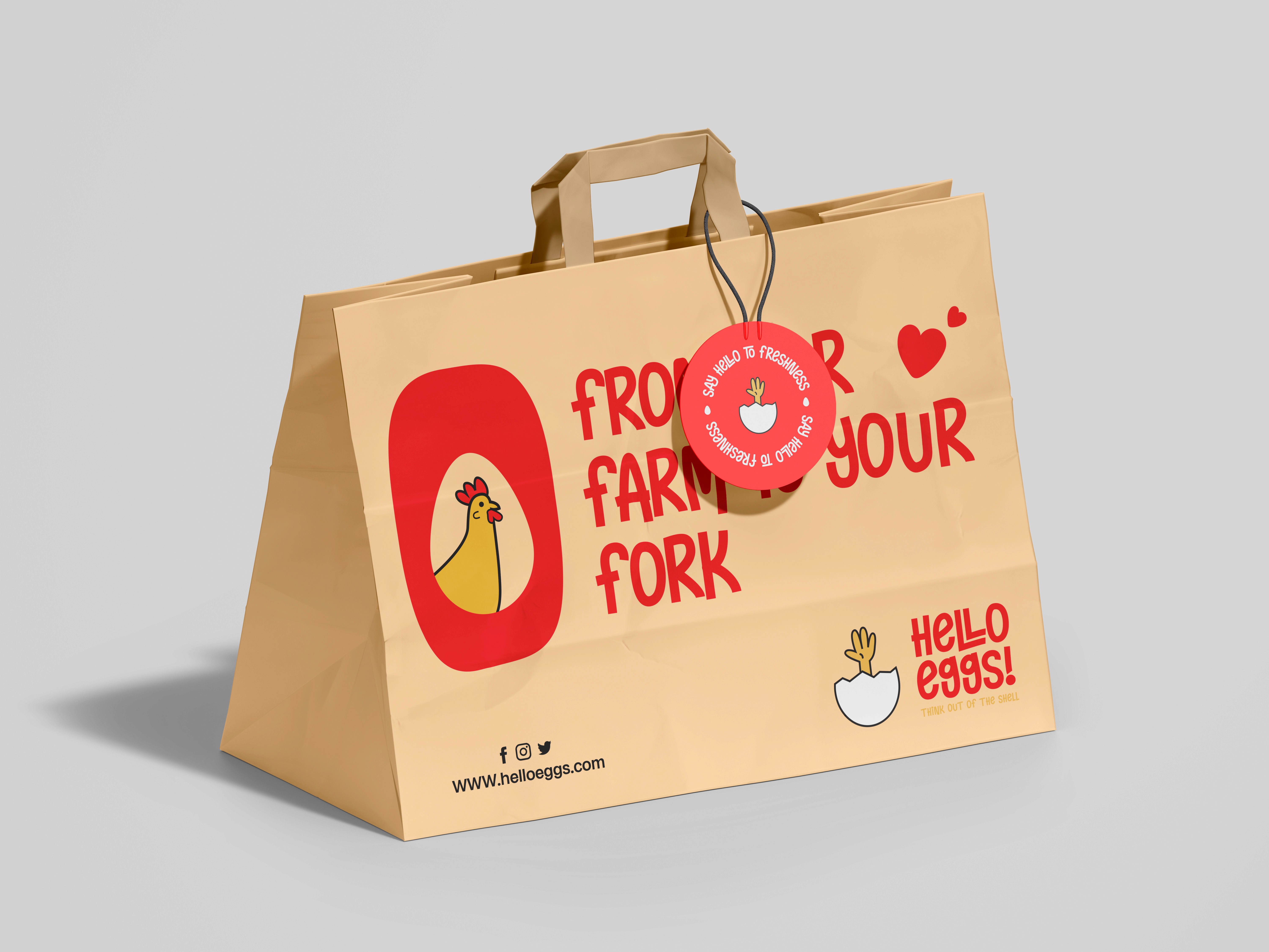
Colorful and Approachable
Colorful and Approachable
Colorful and Approachable
The second goal was to create a visible and approachable brand that felt accessible to everyone. We used a playful color palette and a welcoming font designed to look fun and witty, rather than sticking to typical healthy green visual cues.
The second goal was to create a visible and approachable brand that felt accessible to everyone. We used a playful color palette and a welcoming font designed to look fun and witty, rather than sticking to typical healthy green visual cues.
The second goal was to create a visible and approachable brand that felt accessible to everyone. We used a playful color palette and a welcoming font designed to look fun and witty, rather than sticking to typical healthy green visual cues.
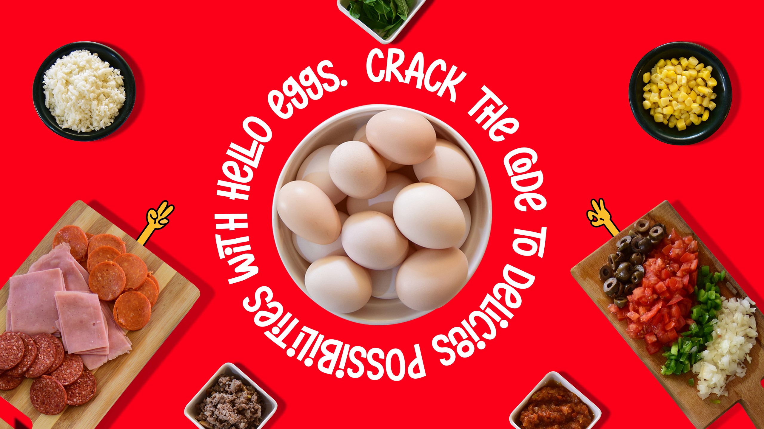
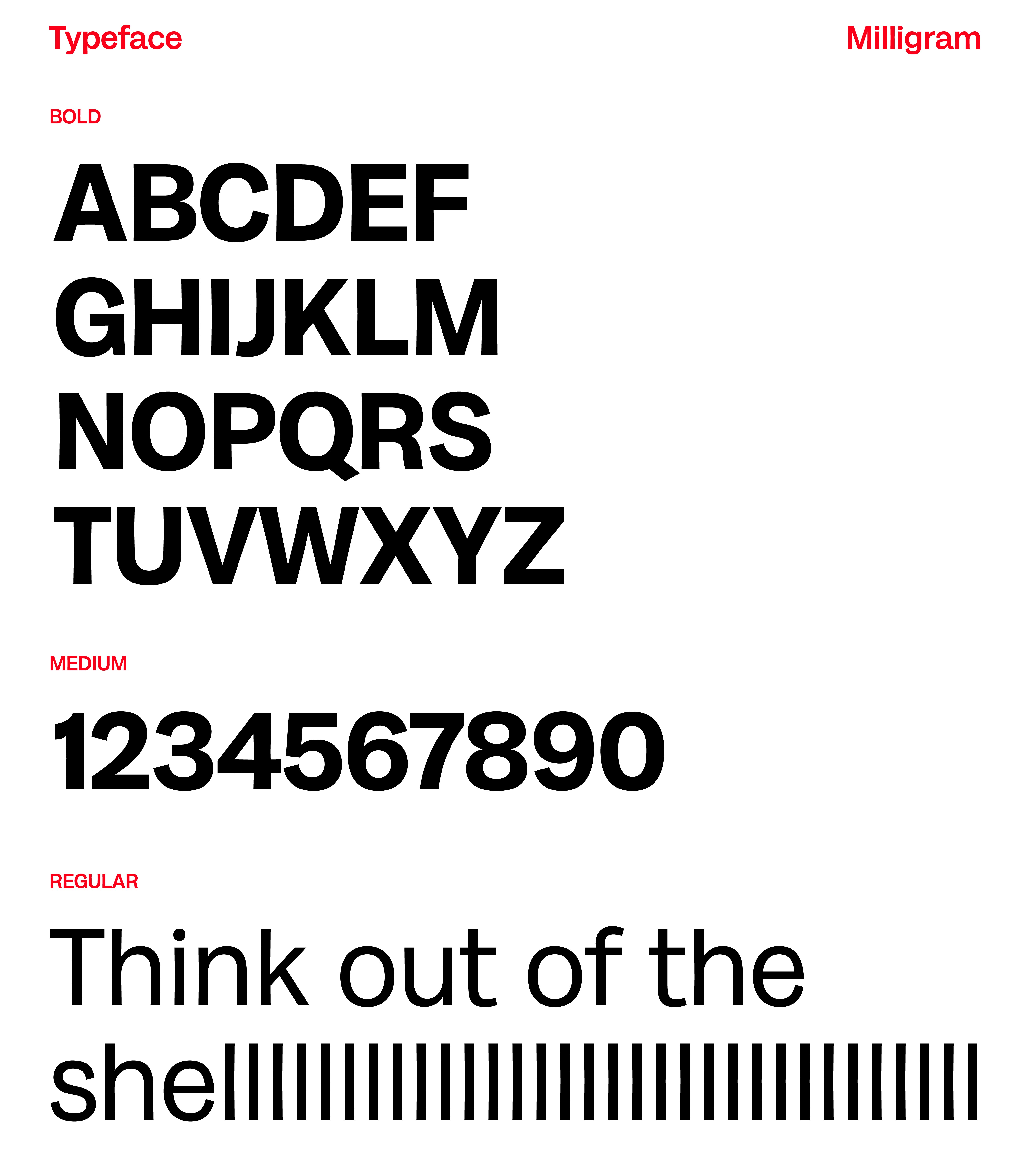
Playfulness and Clarity Together
Playfulness and Clarity Together
Playfulness and Clarity Together
To carry the brand idea, we utilized "Naughty Monster" by Ardyanatypes, which exudes a cheerful and playful impression, making it easy to remember and fun to engage with.
For body text, we chose "Milligram," a grotesque sans typeface designed by Cosimo Lorenzo Pancini and Andrea Tartarelli.
To carry the brand idea, we utilized "Naughty Monster" by Ardyanatypes, which exudes a cheerful and playful impression, making it easy to remember and fun to engage with.
For body text, we chose "Milligram," a grotesque sans typeface designed by Cosimo Lorenzo Pancini and Andrea Tartarelli.
To carry the brand idea, we utilized "Naughty Monster" by Ardyanatypes, which exudes a cheerful and playful impression, making it easy to remember and fun to engage with.
For body text, we chose "Milligram," a grotesque sans typeface designed by Cosimo Lorenzo Pancini and Andrea Tartarelli.
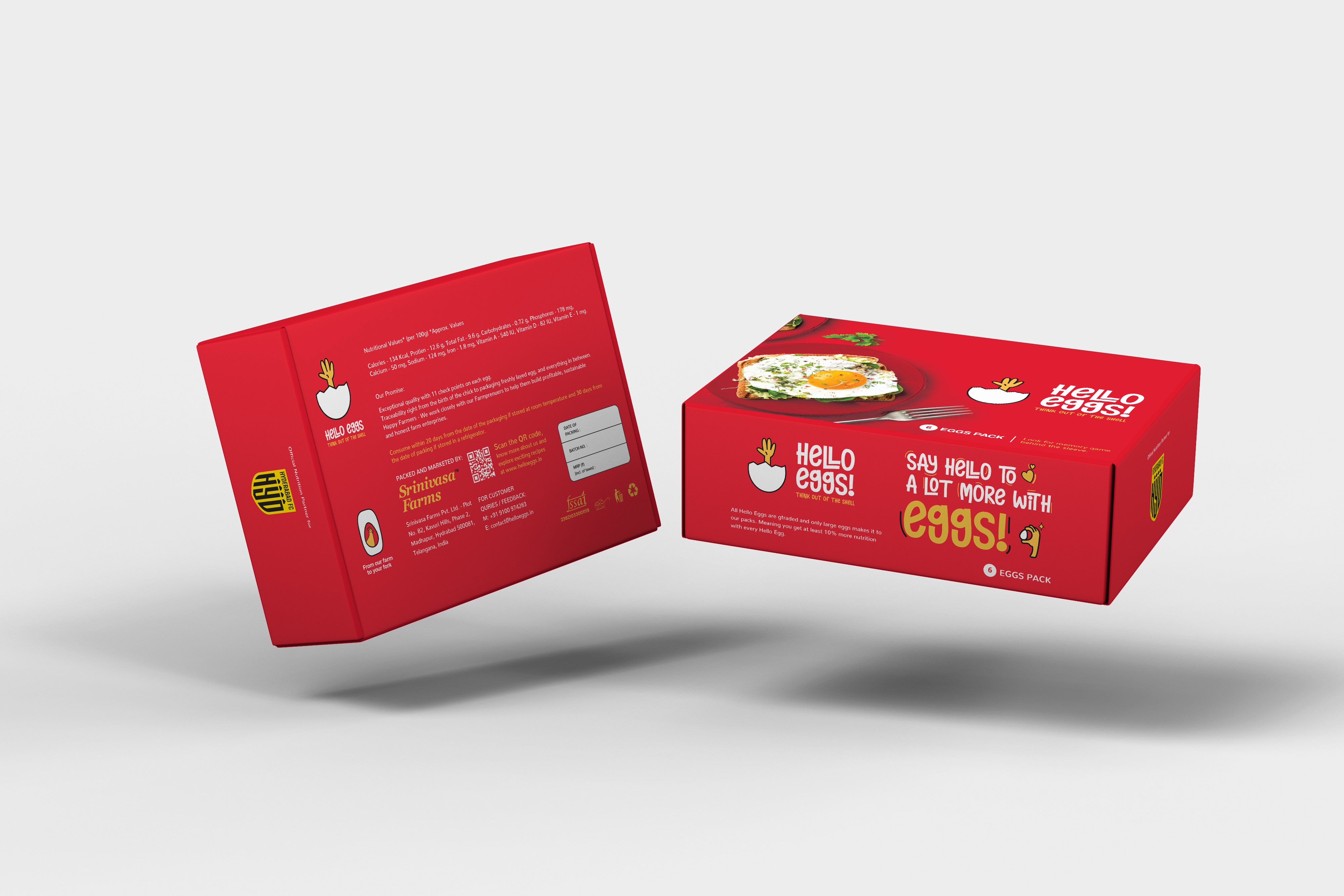
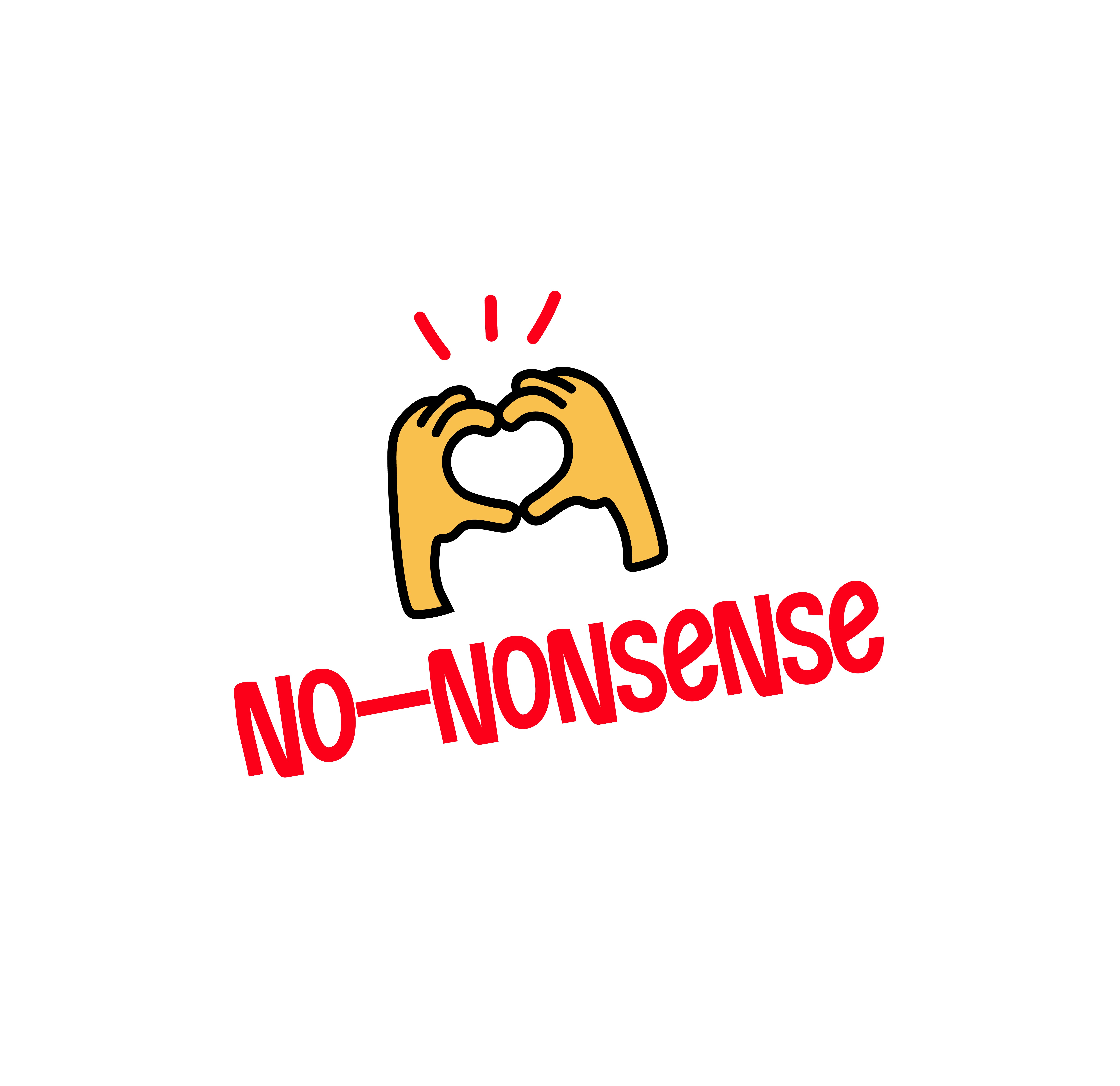
Embracing Fun and Friendliness
Embracing Fun and Friendliness
Embracing Fun and Friendliness
The new identity allows for a seamless expression of no-nonsense fun and friendliness, paving the way for Hello Eggs to continuously evolve into
the future.
The new identity allows for a seamless expression of no-nonsense fun and friendliness, paving the way for Hello Eggs to continuously evolve into
the future.
The new identity allows for a seamless expression of no-nonsense fun and friendliness, paving the way for Hello Eggs to continuously evolve into
the future.